Simplified Journey Maps
A simple, elegant way to present user sentiment across common, well-defined journeys on a site. Using a body of user research which we already possessed, I spearheaded the design of a graphic that could easily communicate how our users felt about commmon journeys. (For example: finding a doctor on a healthcare website.)
Problem & Goals
The UX team lacked an effective and consistent way to communicate user sentiment across mission-critical journeys on a health care website in a visually-appealing, easy-to-understand format. We wanted to make sure that all decision-makers were on the same page with our users' state of mind when performing key tasks.
Our goal was to be able to represent our users during these common journeys which we had a plethora of data on, without necessitating a large journey mapping project. We then set out to create a simple-looking graphic which could be shared easily in a slide presentation that showed:
- A journey's common steps.
- How users felt during each step.
- UX/UI recommendations to improve the user experience for each step.
Role & Team
Role: UX Generalist/Specialist (researcher, designer, developer, etc.)
Collaborators: UI designer
Tools: Illustrator, Figma, Adobe XD
Timeline: about 3 months
Process
- Defining common journeys
- Compiling qualitative and quantiative user data
- Template design
- Iteration & validation
- Handoff & adoption
Solution
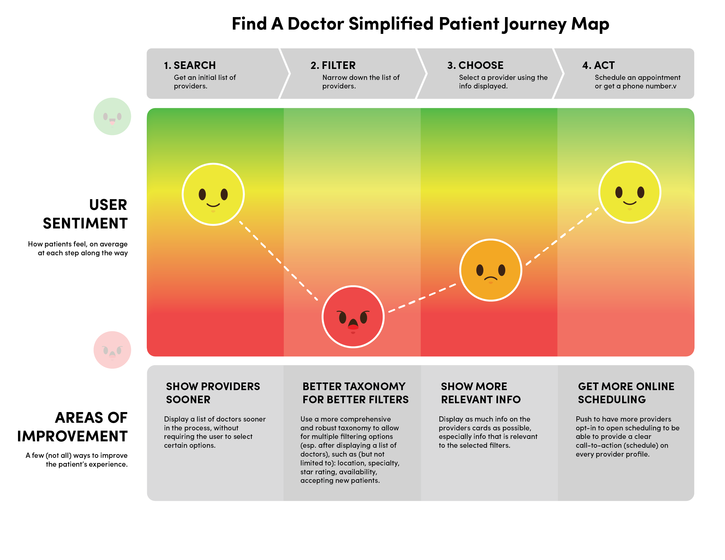
We created a standardized journey graphic which I named "Simplified Journey Maps" to distinguish these from a full journey mapping project. We broke the graphic into three sections: steps, user sentiment, and areas of improvement (read: recommendations).

These were defined through years of user research...
Steps
Each simplified journey map started with the common steps in the journey. Given the "simplified" nature of the graphic, we kept this to three or four well-defined steps. These were defined through years of user research, especially usability data.
User Sentiment
The user sentiment section was defined using the plethora of qualitative user data and the extensive thematic coding that we had done.
Areas of Improvement
Here we laid out our most important recommendation for improving the user sentiment for each step. Our goal here was to create a straightforward title, with a sentence or two describing what needed to be done.
Outcome & Impact
- Increased awareness of how our users felt about important tasks.
- Made it easier for team leadership to comminicate to the rest of the organization.
- Helped focus design and development decisions around what our users were experiencing.
After the design, the team prioritized creating these simplified map graphics for our most important user journeys.
What You Learned & What’s Next
We learned through the process of designing and creating these simplified journey maps how important it is for everyone, especially decision makers to understand how users feel about using our products, especially the most common (and, usually, the most-mission-critical) tasks/journeys. Once everyone was on the same page with this, the users were able to become the central focus of any decision.
Next steps include refining the visual design and determining which user journeys need to reported in this way.
