Experience Report Cards: A Heuristic Reviews Toolkit
A reusable, standardized system for conducting and reporting heuristic evaluations across the organization. This project introduced a consistent workflow, a unified evaluation template, and a reporting format that increased clarity, adoption, and team-wide usability insight tracking.
Problem & Goals
The UX team lacked a consistent structure for conducting heuristic reviews, documenting findings, and sharing results. Efforts varied significantly across evaluators, making it difficult to compare issues, track patterns, and maintain quality across projects.
Heuristic evaluation is a critical method for identifying usability issues early and often. Without a standardized template or reporting format, feedback often lacked clarity, consistency, or prioritization.
The primary goal of the project was to design a codified system for performing and reporting heuristic reviews to be used internally for setting project goals and for project planning. The system must be at once thorough, easy-to-understand, and easy to produce.
Role & Team
Role: UX Generalist/Specialist (researcher, designer, developer, etc.)
Collaborators: UI designer, content specialists, and developers.
Tools: Notion
Timeline: about 2 months
Process
- Discovery & research
- Benchmarking best practices
- Template design
- Reporting framework
- Iteration & validation
- Handoff & adoption
Solution
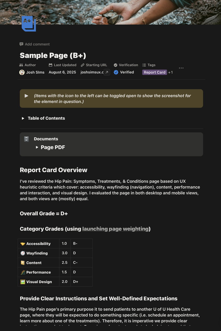
A standardized heuristic review template and reporting framework, which I named "Experience Report Cards," built to be repeatable, readable, and decision-ready. The final deliverable supported issue logging, heuristic mapping, screenshots, severity ratings, and an auto-structured executive summary.

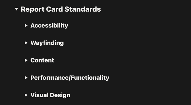
Heuristic Review Standards
Each report card includes the full list of itemized heuristic standards by which each page is scored, broken into five categories:
- Accessibility
- Wayfinding (read: navigation)
- Content
- Performance/Functionality
- Visual Design

Each category has a list of individual standards by which the page is scored. (Example: in "Accessibility" there's one list item is "Does every image have alt text?")
These standards are based on a body of years' worth of qualitative and quantitative user research, analytics data, and other research data collected by the UX team.
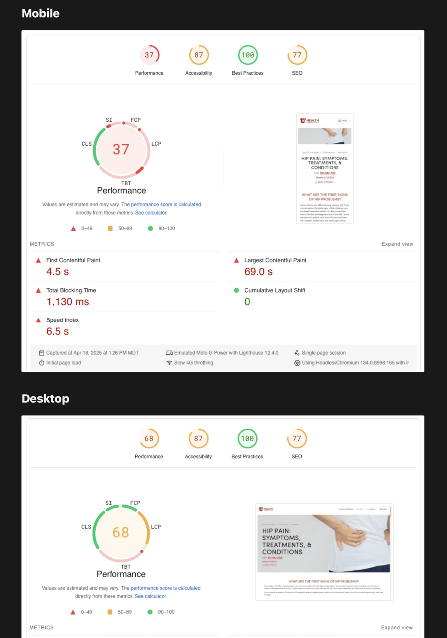
Google Pagespeed Report for An Overview of Technical Performance Issues
Each report also contains a full Google Pagespeed report that outlines the technical issues that need to be addressed. The Pagespeed report also factors into the the grade in the "Performance/Functionality" portion of the report.

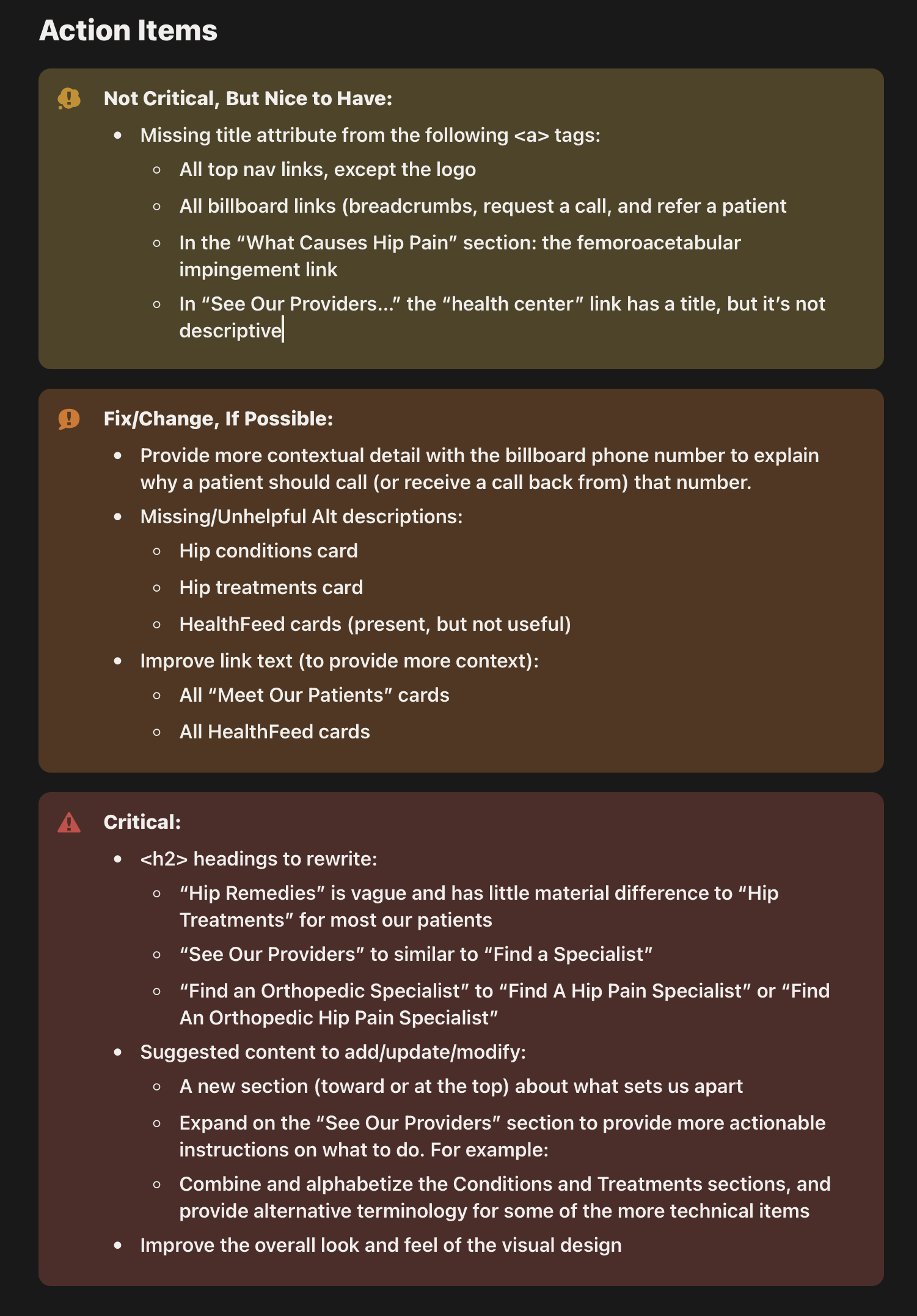
Action Items
Each report has a section which lists individual action items that emerged during the review process. The items are broken out into three prioritization categories, from least urgent to most:
- Not Critical, But Nice to Have
- Fix/Change, If Possible
- Critcal

Outcome & Impact
- Increased consistency and clarity of evaluations across teams.
- Faster turnaround and reduced duplication of effort.
- Improved stakeholder understanding of usability issues
- More issues identified early in the design life cycle
A consistent heuristic review system changed how teams collaborated.
Teams adopted the template quickly, sharing positive feedback regarding readability and ease of use.
The report cards became an opening task for every project in order to uncover and detail the most crucial elements for the team to focus on to get the best possible outcome with a project.
What We Learned & What’s Next
While performing UX heuristic reviews were not new, being able to present them in a succint, well-sourced report made them an essential part of the start of every project, especially site redesigns. Presenting the findings and recommendations in this format made it straigtforward for designers, developers, and content designers to pull out their most important tasks for the project.
Experience report cards also made it much easier for leadership to be able to justify design, development, and content decisions because of the easy-to-understand presentation.
Next steps include expanding the template to support accessibility reviews, integrating into dashboards, further refinement of the itemized heuristic standards, and exploring potential automation.
