Case Study: In-Person Studies Uncover Unexpected Solution
Big, ugly lists are better than neat, orderly categories: or, how I learned how to value the user more than the aesthetics of a design. Using in-person usability and closed card sorting I observed the preferred way for users to find what they're looking for.
For years, the accepted, unquestioned design thinking for lists, especially long ones, was: break lists into chunks by placing items in clear categories to make them more digestible for patients, and avoid dull, monotonous visual design by avoiding the use of plain unordered lists.
Additionally, the assumption was that by using the technical, scientific terms for specific treatments and conditions ensured users would be able to find what they were looking for more quickly and accurately.
For smaller lists (around 15 or fewer items), these visual design assumptions didn’t have much of a negative impact on the user’s ability to quickly find what they were looking for. However for more extensive lists it became clear, after targeted usability research, that this proved to challenging for users.
Also, regardless of list size the use of exclusively technical terminology (e.g. “coronary artery disease” instead of “heart disease) made it much more difficult for users to locate what they wanted.
Problems of the Heart
Working for a health care system, I was assigned a project to reorganize the list of specialties, conditions, etc. on the cardiovascular department homepage (at the time it was called “Cardiology, Circulation, & Heart Surgery”), which looked like this:
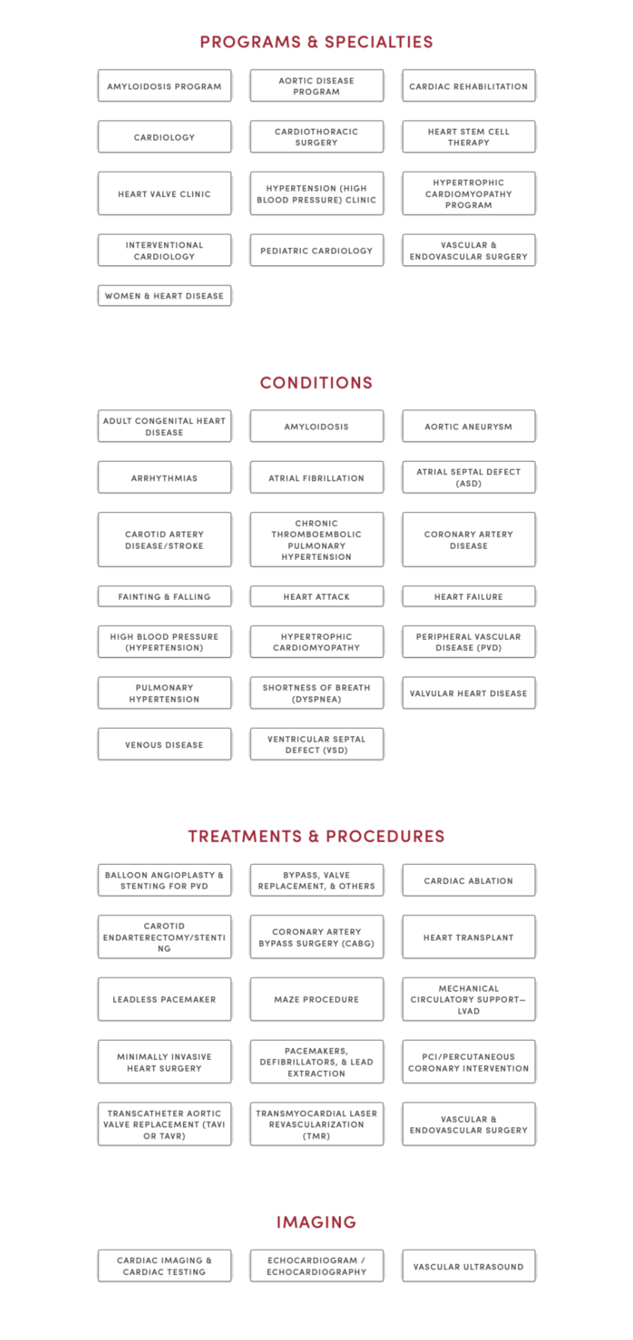
The list(s) here seemed to break all the rules: it almost exclusively used technical terminology; the items were grouped somewhat arbitrarily (to patients); and in spite of being a long list, each link was a button. The list was difficult to scan, did not attempt to clarify clear areas of confusion, and took up a lot of space.
The majority of patients had a difficult time seeing the difference among the four categories: “Programs & Specialties,” “Conditions,” “Treatments & Procedures,” and “Imaging.” Understandably, there was no meaningful distinction among the four. For example, if a patient were looking treatment for hypertrophic cardiomyopathy, would they look in Treatments & Procedures? Or, is it a condition? Maybe it’s a program? Hypothetically, to the patient, it could be in any of those.
When the Proposed Solution Is Worse Than the Problem
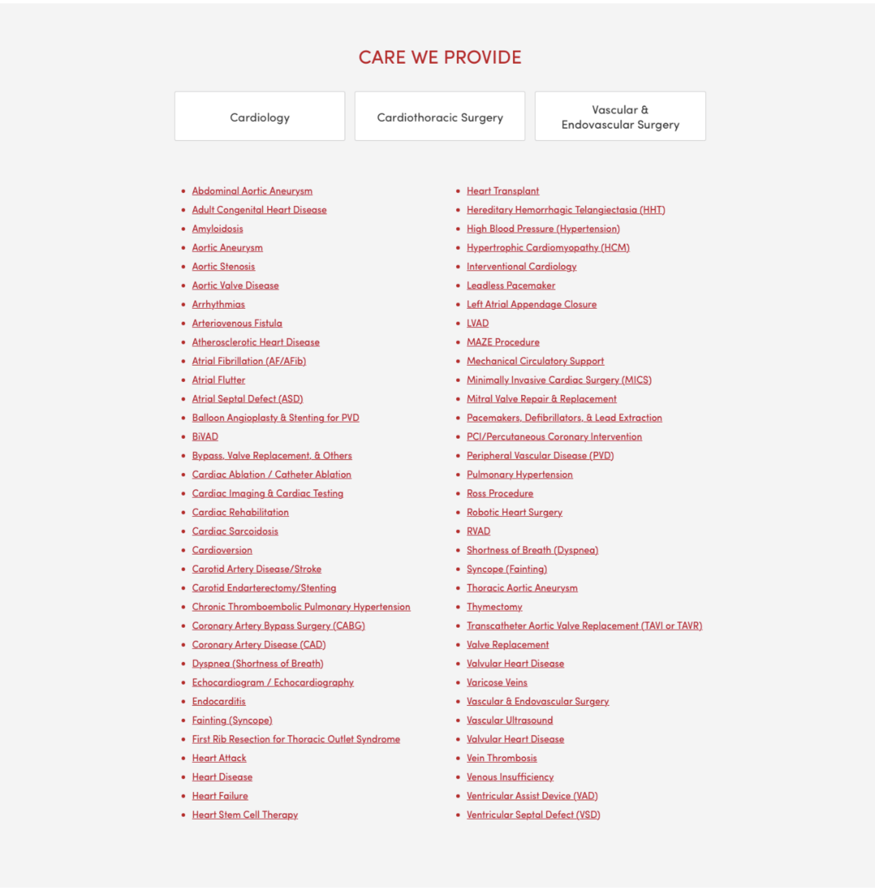
When the project was assigned, it came with a solution pre-decided by the stakeholders-instead of those categories, move all the buttons into three new categories: “Cardiology,” “Cardiothoracic Surgery,” and “Vascular & Endovascular Surgery.”
Immediately we knew that those categories, while perhaps making sense to the medical staff, would be even harder for patients to navigate. Take the hypertrophic cardiomyopathy example, which category would it fall under? Even the most educated patient would have a hard time with that. (Hint: it’s all three.)
We responded by recommending to combine all the items into a single, alphabetized list that was, in fact, longer than the current lists combined since we also proposed adding alternative terminology wherever possible, along with the more technical phrasing. However, the stakeholders did not like that recommendation and could not be dissuaded from their requested grouping.
Instead we proposed performing some testing with actual patients in the cardiovascular clinic inside the hospital. The staff were enthusiastic about this and made it so we could start as soon as possible. They helped us schedule a day and time and a room inside the clinic where we could conduct the usability testing.
Real Patient Data Outdoes Expert Recommendations
We created a prototype page with our recommended solution, (we added their three categories as individual buttons at the top of the list which linked to their respective pages):
The test was designed into two parts*:
- A randomized usability test where patients (or caregivers) were shown one of three pages: the current page live page, a prototype of the stakeholders requested changes, and our recommended solution. They were then asked to find information about the reason for their visit to the clinic, as if they were at home, with the device they would use. So, if they would use mobile, we had them use their own phone; otherwise we had a laptop for them to use. (In order to ensure patient privacy, none of the sessions were recorded. We simply kept anonymized, handwritten notes.) As is standard practice in usability tests we also asked that they think out loud, verbalizing their thought process. We were most concerned with recording two data points:
- If they were able to find what they were looking for.
- How long it took to find what they were looking for, or how long it took them to give up if they couldn’t find it.
- A closed card sort with the three requested categories and 5-10 items from each where the patients were asked to place each item into one of the three categories.
We performed 30 usability tests (10 for each version) and the results were clear and somewhat surprising. While we were confident that our proposal would perform better (we expected the failure rate to drop by about 1/2 and the total time to complete to be about 20% shorter), we couldn’t have anticipated what we saw.
The failure rate for each version were, from lowest to highest:
- Our proposed redesign
- The old (read: then-current) design
- The stakeholder-requested redesign
About 50% of patients using the stakeholder design failed. 30% of patients failed with the old design. None of the patients using the UX-recommended design failed to find what they were looking for.
The average time to completion (throwing out those who failed), again from lowest to highest:
- Our design ≈ 54 seconds
- The old design ≈ 87 seconds
- The stakeholder design ≈ 92 seconds
Those results become even more unambiguous once we averaged the times after removing the lowest and highest times from each:
- Our design ≈ 28 seconds
- The old design ≈ 82 seconds
- The stakeholder design ≈ 89 seconds
The results with the card sort (we performed almost 40 card sorts) were just as conclusive, just in a different way: the majority of testers placed the majority of items into categories mostly at random. For the few who seemed confident in their grouping, their resulting categories rarely got close to matching the stakeholder proposal. Interestingly, none of those few confident sorters had tested the stakeholder design in the first part of the test.
For long lists of navigation links, it seems “intuitive” or common sense to break them up into more manageable groups. The human mind tends to want things like this sorted. However, when looking for a specific item on a webpage we’ve never visited, unless the category would be obvious, it’s actually best to simply present all items in a single, inclusive list that’s easy to parse and scan.
*Note: we actually had three parts: before the other tests we showed each design briefly and asked them to rank them by which best and which seemed like they’d be the easiest to use. As expected, in both, our design came in last with more than half of the testers. None thought it was the most visually appealing (at best, it was ranked second with a few) and four thought it would be the easiest to use.